Airbnb
Summer 2019 Airbnb Plus OpsTech Experience Design Intern
I interned with the Airbnb Plus Operations Technology team, where I worked on designing internal tools and visual systems to improve the employee onboarding experience and workflow efficiency.
I had an amazing experience working on various projects throughout the summer and spent six weeks on my keystone project. The project's goal was to design a visual system that allows operations agents to easily learn keyboard shortcuts in a non-invasive and functional way. I researched in-class examples of existing systems, collaborated cross-functionally across teams, and used systems design thinking.
Context
📋 Overview
Airbnb Plus is a program for Airbnb listings with exceptional quality, comfort, and style. In my team, OpsTech, we developed internal tools to help resolve skills shortages and enable employee retention within the Airbnb Plus team. My keystone project (six weeks) was to design a library of keyboard shortcuts and develop a foundational point-of-view for the company to visualize shortcuts. I conducted a case study on Plus Tools, an evaluation tool used by operations agents to determine a listing’s Plus program eligibility, but also had to keep in mind how my design would work in other tools as well.
👩💻 Stakeholders
For this project, I had to continuously communicate with my stakeholders to update them on my progress as well as be proactive in seeking out feedback. I checked in with software engineers Amisha Patel and Matt Montag for engineering feedback to identify any limitations or restrictions and proposed solutions to any roadblocks. I received creative feedback from bi-weekly design critiques with the Airbnb Plus design team. I also had the opportunity to work with and received insights from the Airbnb Trust team, with Experience Design Intern Angel Vuong and Experience Designer Justin Danks.
Problem
⚡️ The Challenge: How can we help agents easily learn tool shortcuts to work more efficiently?
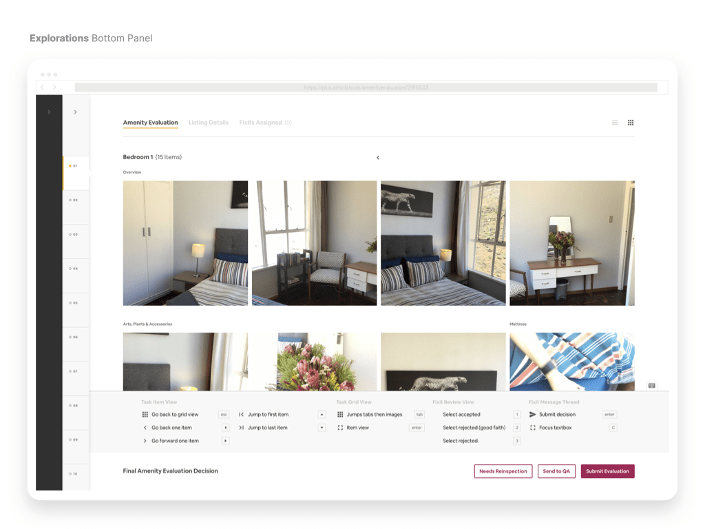
Plus Tools is designed to be used with accuracy, efficiency, and speed. Shortcuts can provide a better user experience by reducing finger and wrist fatigue of operations agents using these tools all day for hundreds of listings and helping them work faster and more accurately.
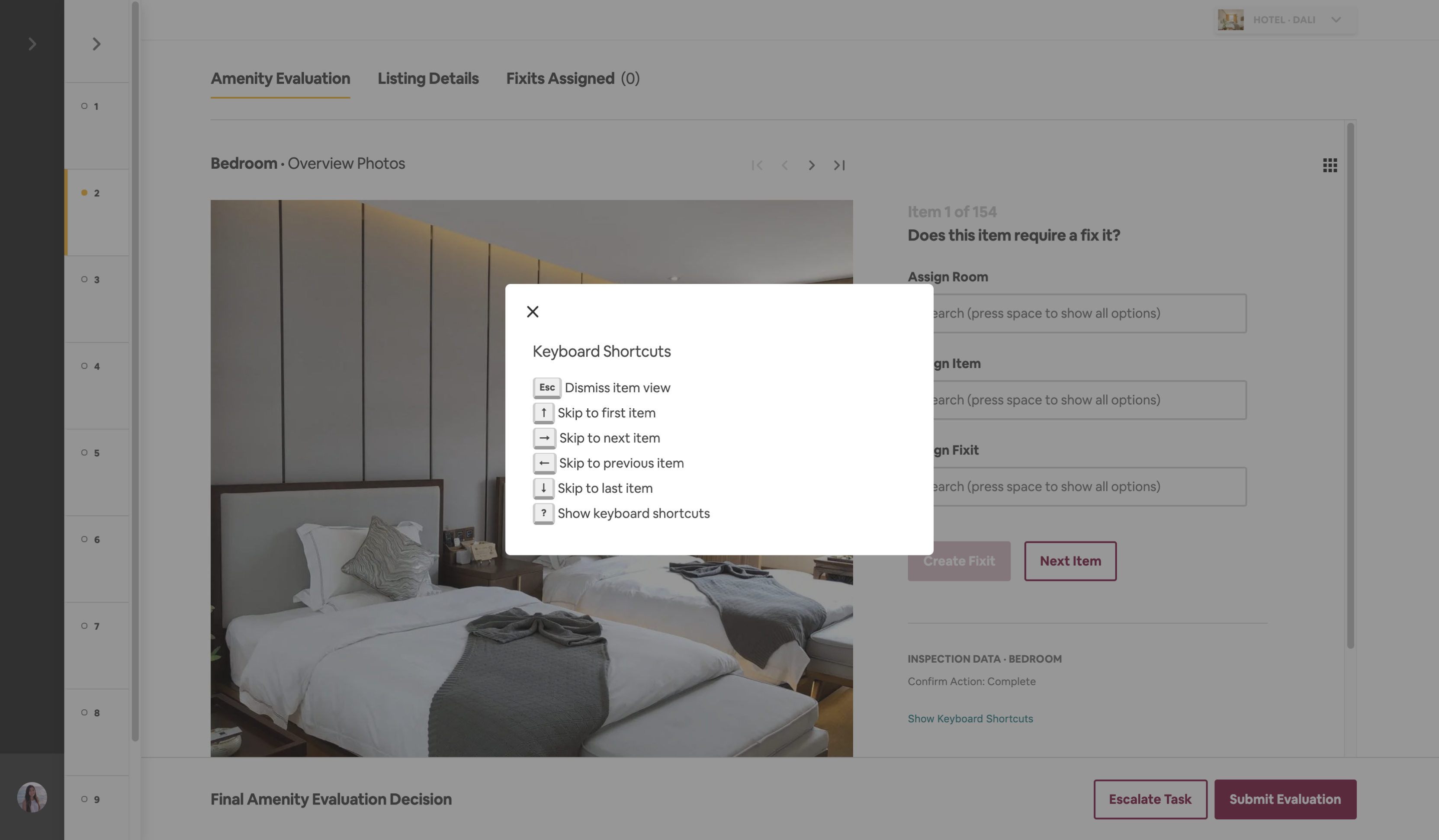
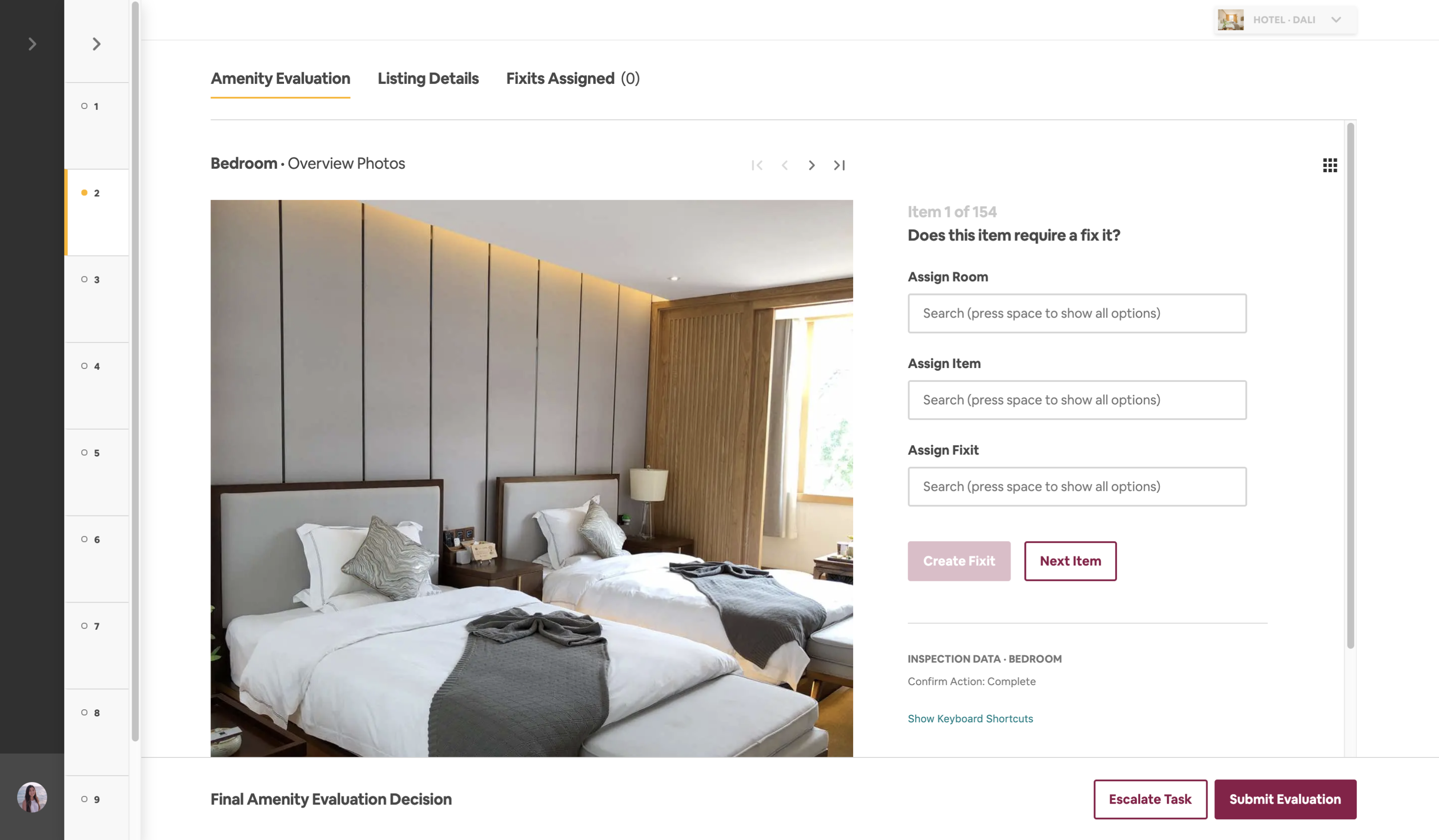
Plus Tools and existing Keyboard Shortcuts system
Design Process
📚 Research
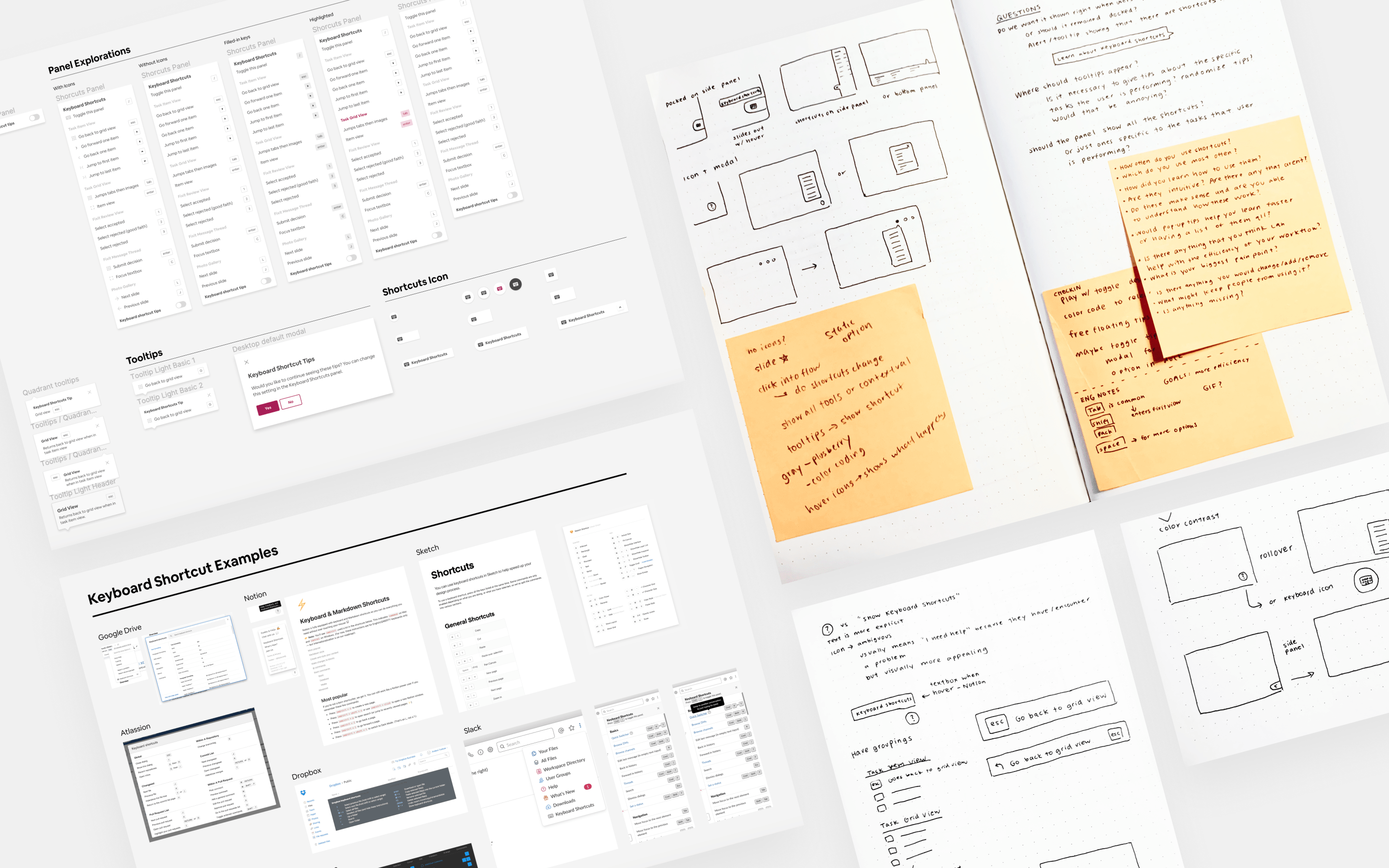
My first step was to understand the constraints of the Airbnb Design Library System (DLS) and find components I can leverage. I researched in-class examples of existing shortcut libraries, such as Google Drive and Figma.
I conducted user interviews with Design Reviewers to learn more about how they used the existing keyboard shortcuts system. They revealed that they learned shortcuts through in-person coaching, trial & error, or didn’t know about shortcuts at all.
“I have to click and move around my mouse a lot. I wanted and asked for a list of shortcuts but was never given one.”
- Interior Design Reviewer
“I don’t know any shortcuts. I also did not receive any training to learn the tool.”
- Design Reviewer
DESIGN
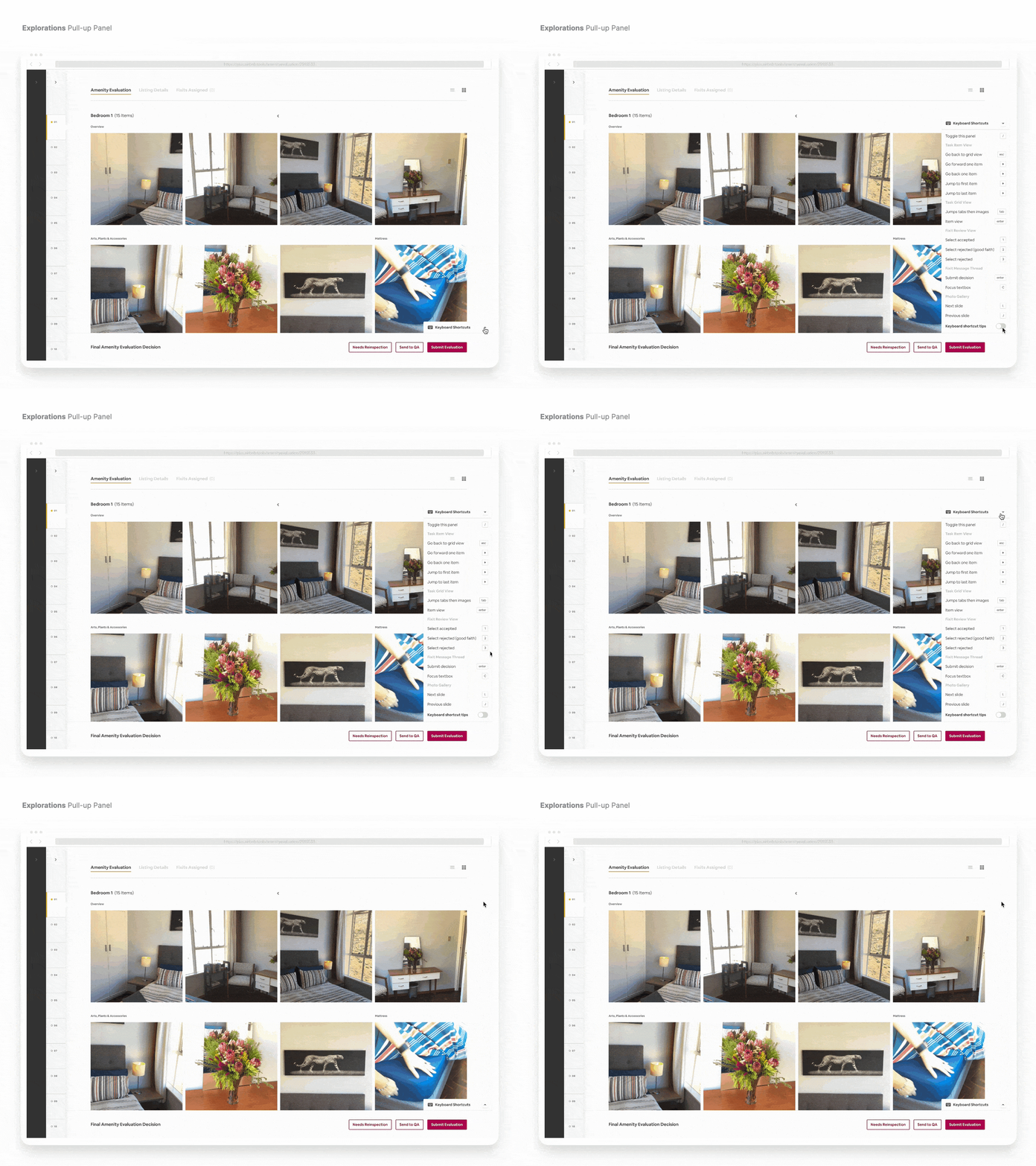
Panel Format
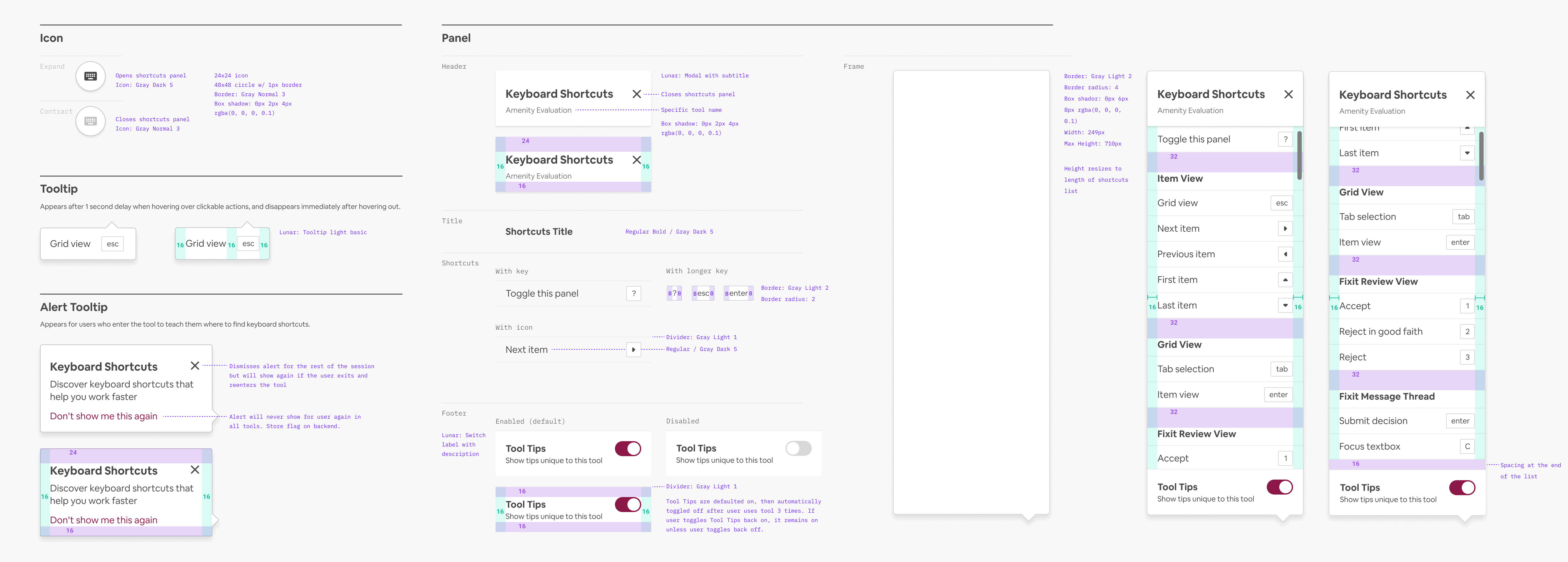
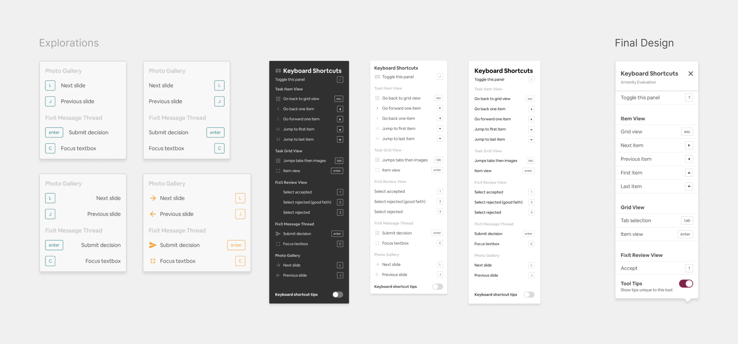
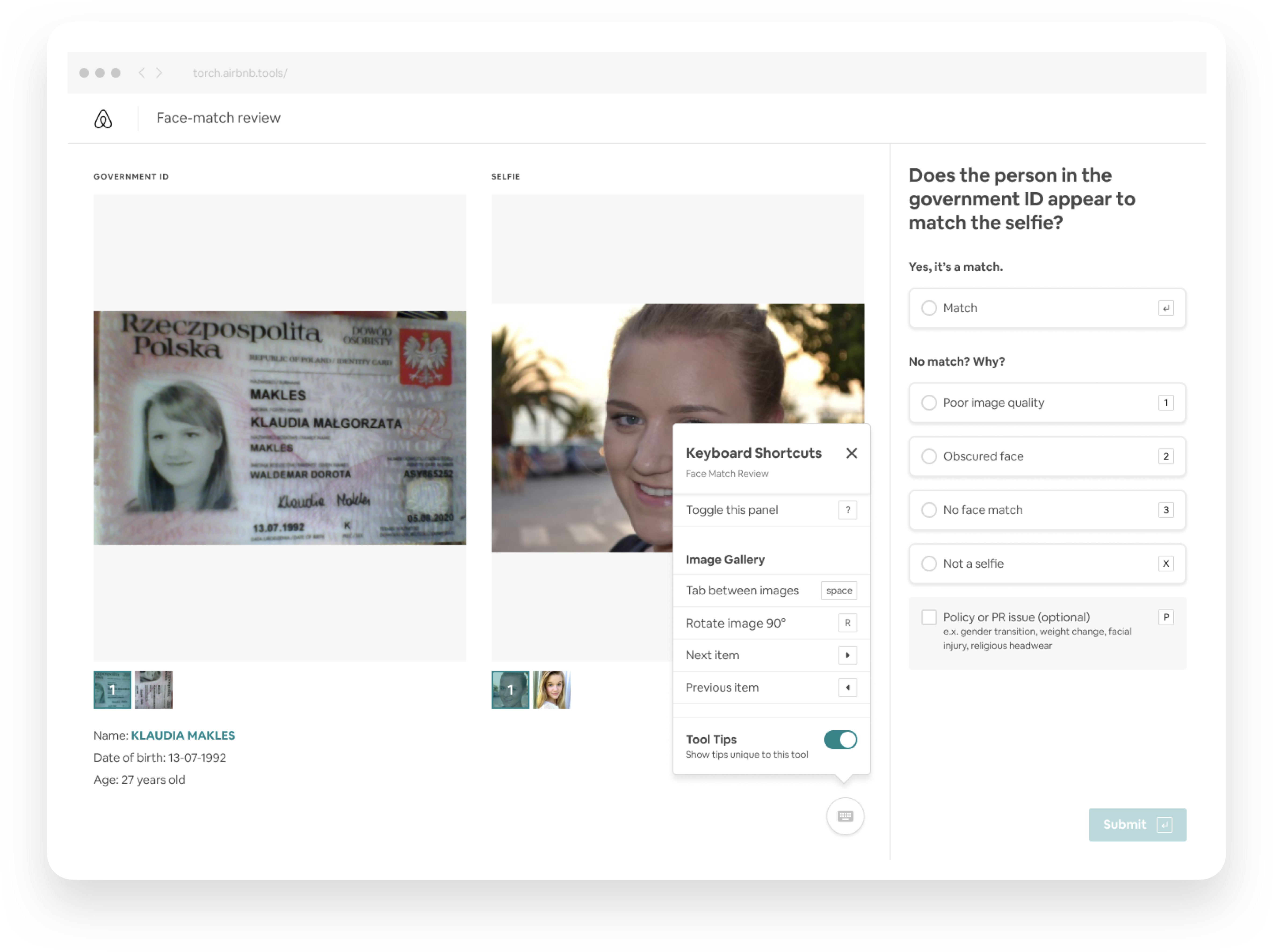
I explored the formatting and hierarchy for the panel and received much feedback in critique on legibility. In the final design, I added more whitespace, dividers to separate shortcuts, and grouped them into clear categories.
DESIGN
Entry Point
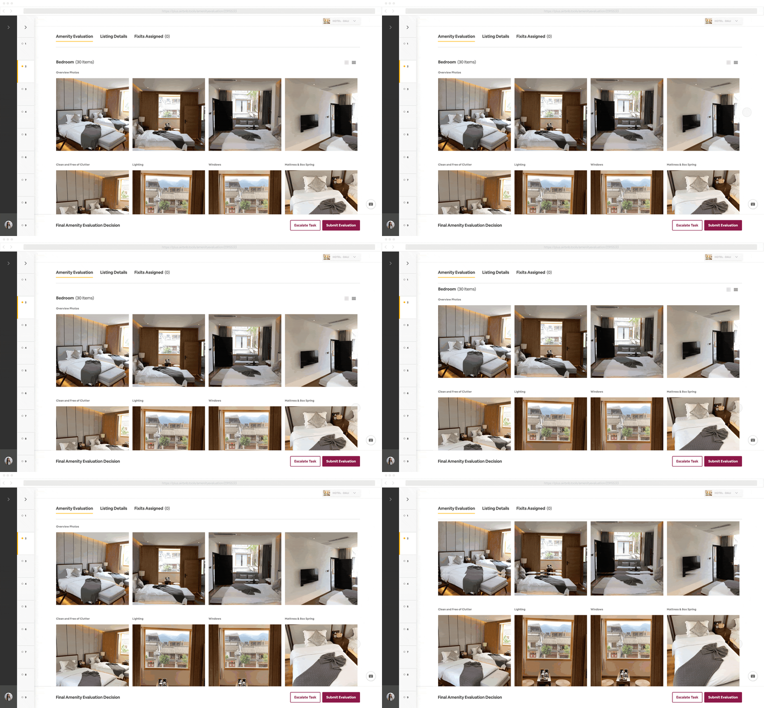
The problem was that there was no menu or settings within Plus tools, where people would typically look for and find shortcuts. I had to think about how and where these shortcuts would appear. My final solution was a clean and simple button icon that also worked well within other tools.
DESIGN
Tooltips
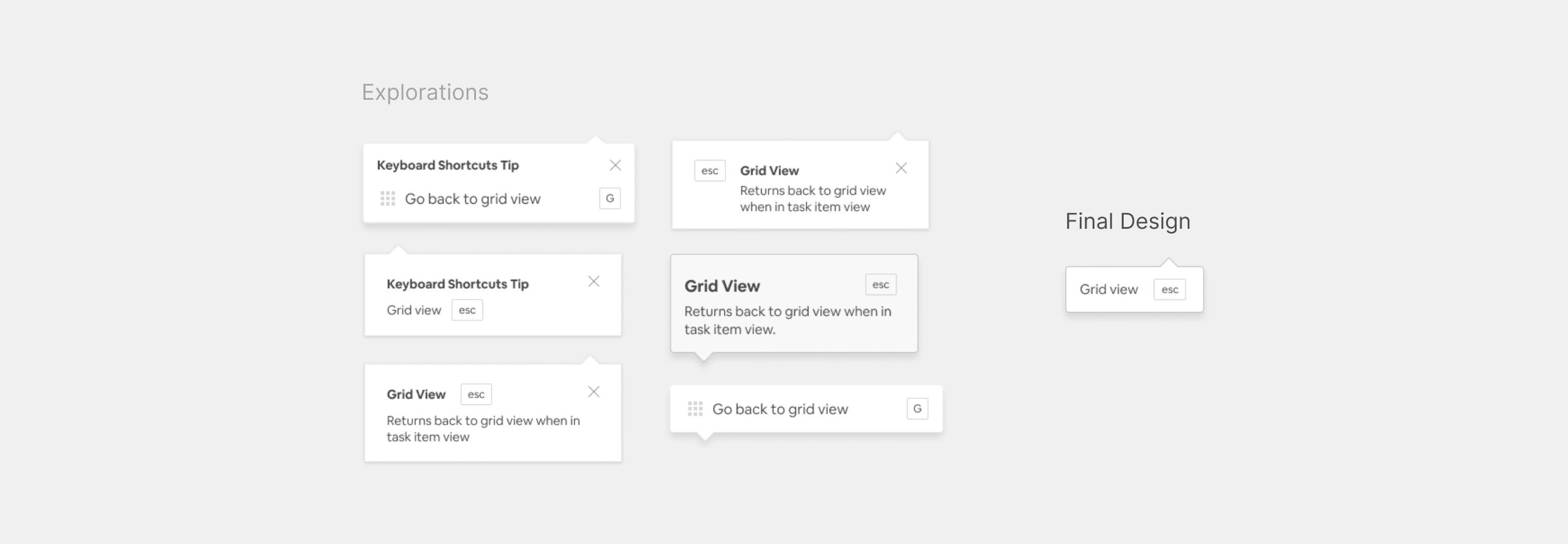
I wanted to explore opportunities to further educate users on how they can incorporate shortcuts by adding tooltips. However, how would these tooltips appear? Would it populate randomly based on the most used shortcuts? Or would it show a list of shortcuts that were relevant to the current page? I found that the simple and most straightforward design worked best and was the easiest to learn from through usability testing.
DESIGN
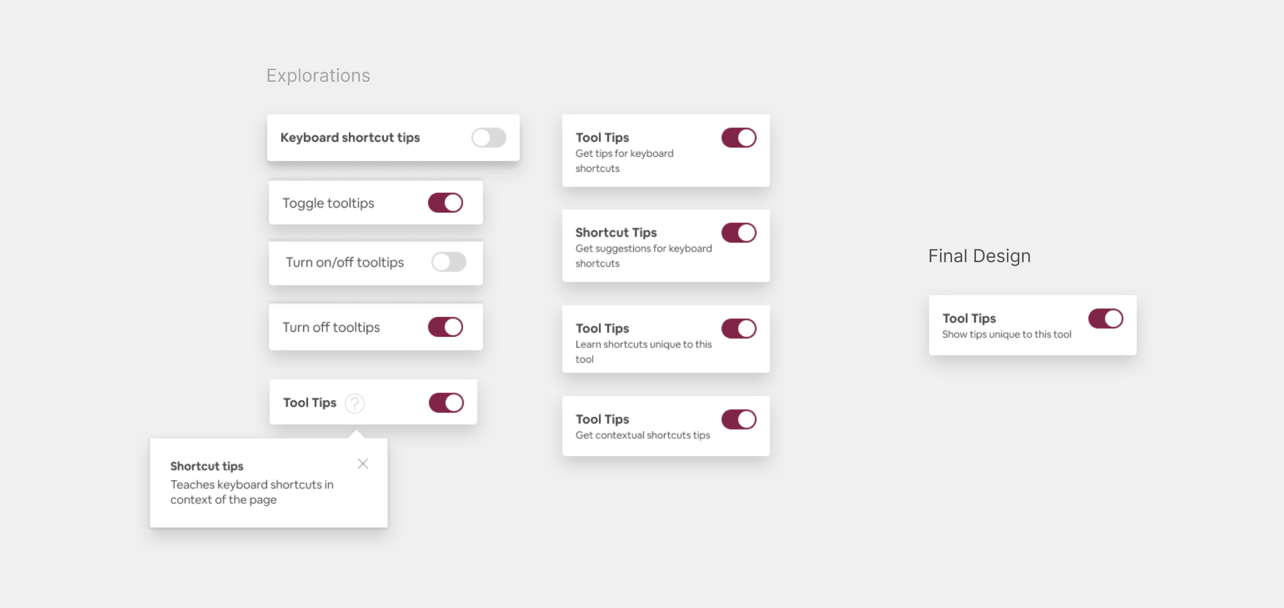
Tooltips Toggle
I included a tooltip toggle to give users control on whether or not they wanted to use tooltips. It was challenging to find the right wording that clearly explains the toggle’s use. During usability testing, users commonly mistook that it would turn off the entire keyboard shortcuts list. After discussing with stakeholders and the content strategist, we were able to put together wording that made the most sense.
DESIGN
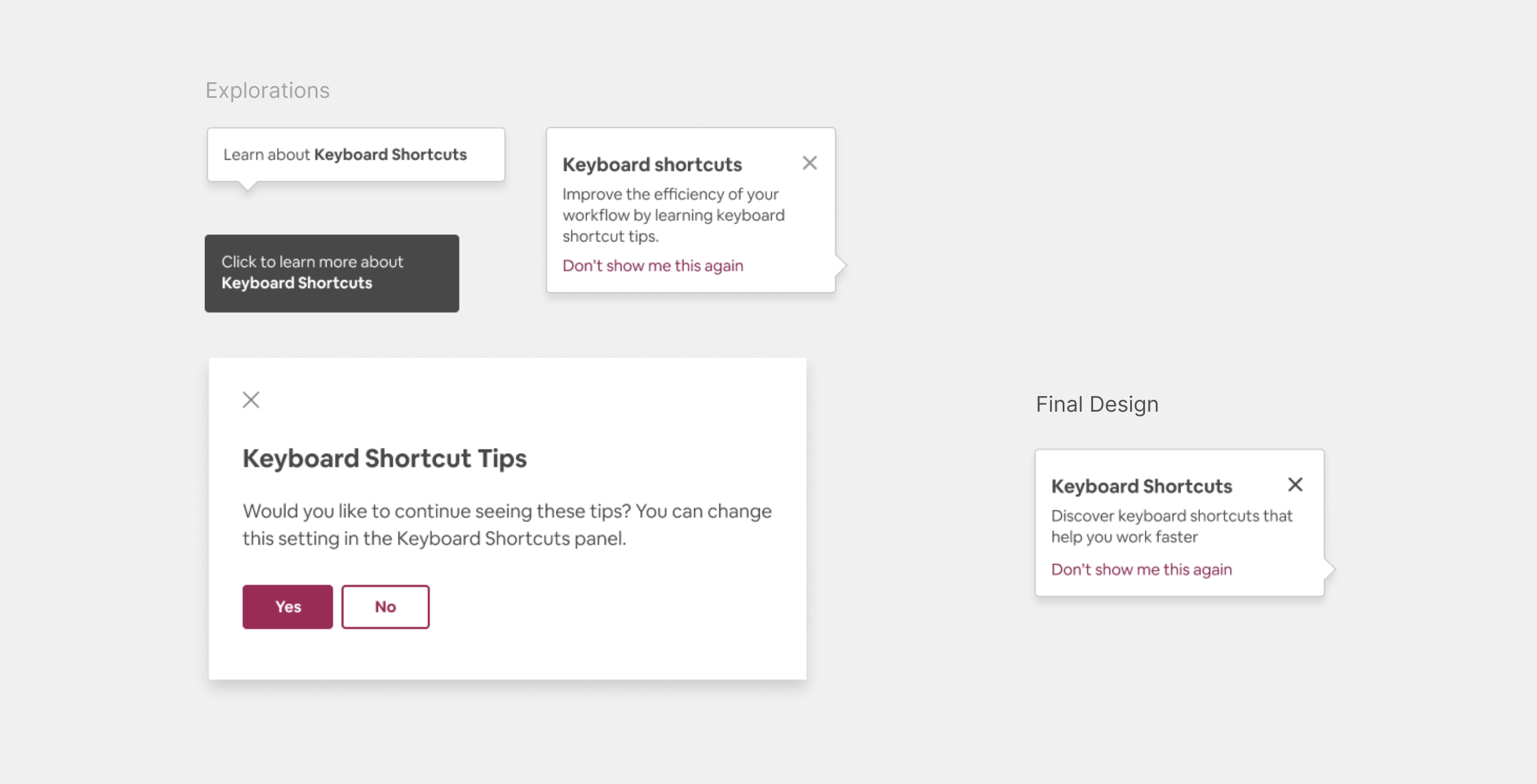
Alert
To educate users that keyboard shortcuts exist, I included an alert that would display when they open the tool. During the research, I found that most programs will not tell you that keyboard shortcuts exist. As more new agents were being on-boarded to Plus Tools, I wanted a way for them to learn keyboard shortcuts right from the start instead of discovering them on their own much later on.
Final Keyboard Shortcuts Library design
Outcome
🤝 Trust Tools
I collaborated with another Experience Design Intern Angel Vuong in the Airbnb Trust Team to incorporate keyboard shortcuts into her project.
💎 Design Library System Component
I designed my project to scale it as a reusable component for the Design Library System for teams across Airbnb to adopt in custom solutions. I detailed development notes and handed-off an organized final Figma file to allow the engineer to jump in and implement without needing to ask for much input from design.
Takeaways
Develop Design Craft
Develop Design Craft
This project allowed me to practice critical thinking, attention to detail, and human-centered design thinking to consider all the useful features I could add to such a simple tool. I sought opportunities to experiment with novel interactions and patterns and explore edge cases that were not initially captured in the project brief. Through my collaborations with engineering, I was able to learn how to consider edge cases and understand backend logic to build a component for the Design Library System.
In the end, I was able to deliver a feature that is intuitive and functional, with a visual system designed to subtly educate the users of shortcuts available but ultimately give all control and flexibility to the end-user. The most rewarding experience for me is knowing that Airbnb teams will use my intern project.
💛 Embrace the Adventure
During my internship, I met inspiring people who have all pushed and guided me to grow. I came into it thinking that I would just be working on my craft, but I also discovered opportunities to work on my soft skills such as confidence, communication, and leadership. I had to be proactive in
leading conversations, updating stakeholders, and driving a point-of-view. By asking questions, I could get ahead of potential roadblocks and help user efficiency across Plus tools.
I want to give a special shoutout to my amazing manager Stephanie Szabo, and my awesome mentor Edwin de Jongh for supporting my growth and for teaching me lessons that I will carry on to my future endeavors!
