Fitbit Stress Management Page
September 2020
Crafting an experience that is intuitive, beautiful, and engaging to help people succeed in their health and fitness journeys ✨
Fitbit is a consumer electronics company with fitness products, including smartwatches and trackers, to help users stay motivated and improve their health.
During the summer before my 4th year of college and amidst the COVID-19 pandemic, I joined the Fitbit Creative Lab team as a full-time contract Web Production Designer.
*During my time at Fitbit, I worked on projects that I cannot disclose due to NDA restrictions. Please contact me for more information at [email protected].
Context
Overview
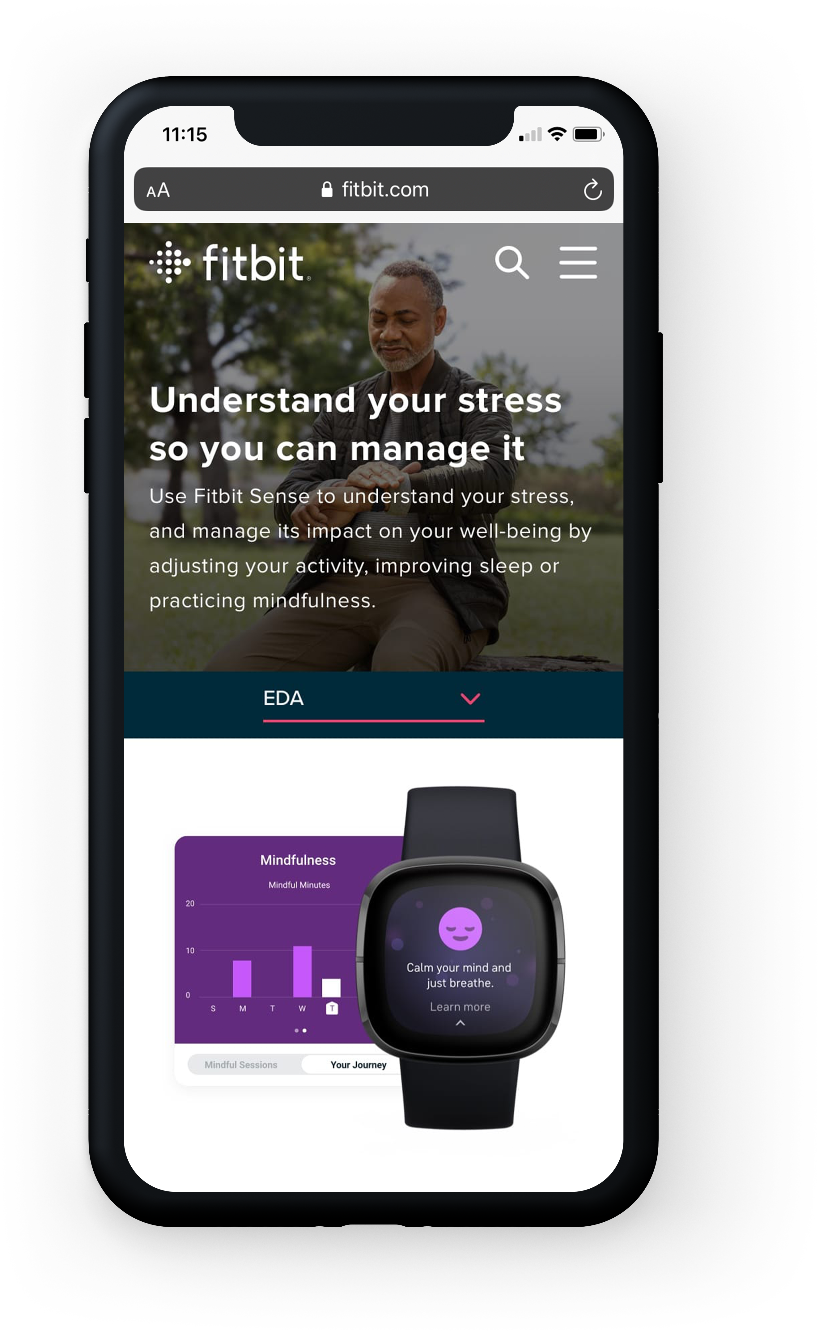
Working on the Stress Management page was one of the most rewarding experiences, as I was able to see this project launch on Fitbit.com due to the fast turnaround rate. I collaborated closely with the team to define, develop, and deliver visual designs in a consumer-facing environment. The ask was to create a web page to inform and educate users about the new Fitbit Sense smartwatch’s stress management feature.
My Role
As the sole designer, I was responsible for designing the UI, UX, rendering layouts, and selecting photography. I primarily worked with copywriter Jennifer Elam and project manager Drew Hudson. I created frameworks and prototypes to share the vision, design principles, and content strategy. This helped to conceptualize ideas, gain alignment, and drive decision making.
Timeline
Over the six week timeline, we had four creative reviews where design lead Monica Calmet and copy lead Danielle Naboulsi gave feedback and critiques, and two stakeholder reviews where multiple stakeholders gave higher-level business direction. I roughly had two weeks of total design time, as I had six days for the initial design development and then 1-2 days between reviews for edits.
Project Brief
Fitbit Sense, an advanced health smartwatch, was launched in Fall 2020 and introduced with innovative tools for stress management, heart health, SpO2, and more.
We needed a way to incorporate all the new information under the Technology section of Fitbit.com while making it easy to comprehend and find without overwhelming the user.
⚡️ The Challenge: Balancing style with an efficient user experience
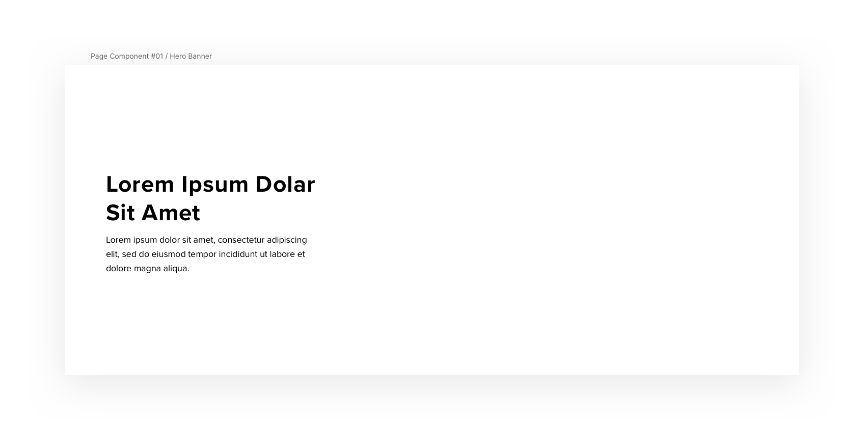
The stress management page must aesthetically and strategically use existing web components and Fitbit brand assets while having a consistent experience across all the feature pages.
Design
The copywriter and I collaboratively laid out an outline for the information. We decided to organize the stress management page content in 4 sections:
- Electrodermal Activity (EDA) - Learn about EDA technology and how it works to measure stress and practice mindfulness
- Stress Management Score
- Reflections - How to use the Reflections feature to give the user a holistic picture of handling stress
- Premium & Sense CTA - Provide a call-to-action to join a Fitbit Premium subscription and purchase a Fitbit Sense smartwatch
This architectural decision had a major impact on the quality of the user experience and allowed them to quickly familiarize themselves with useful information.
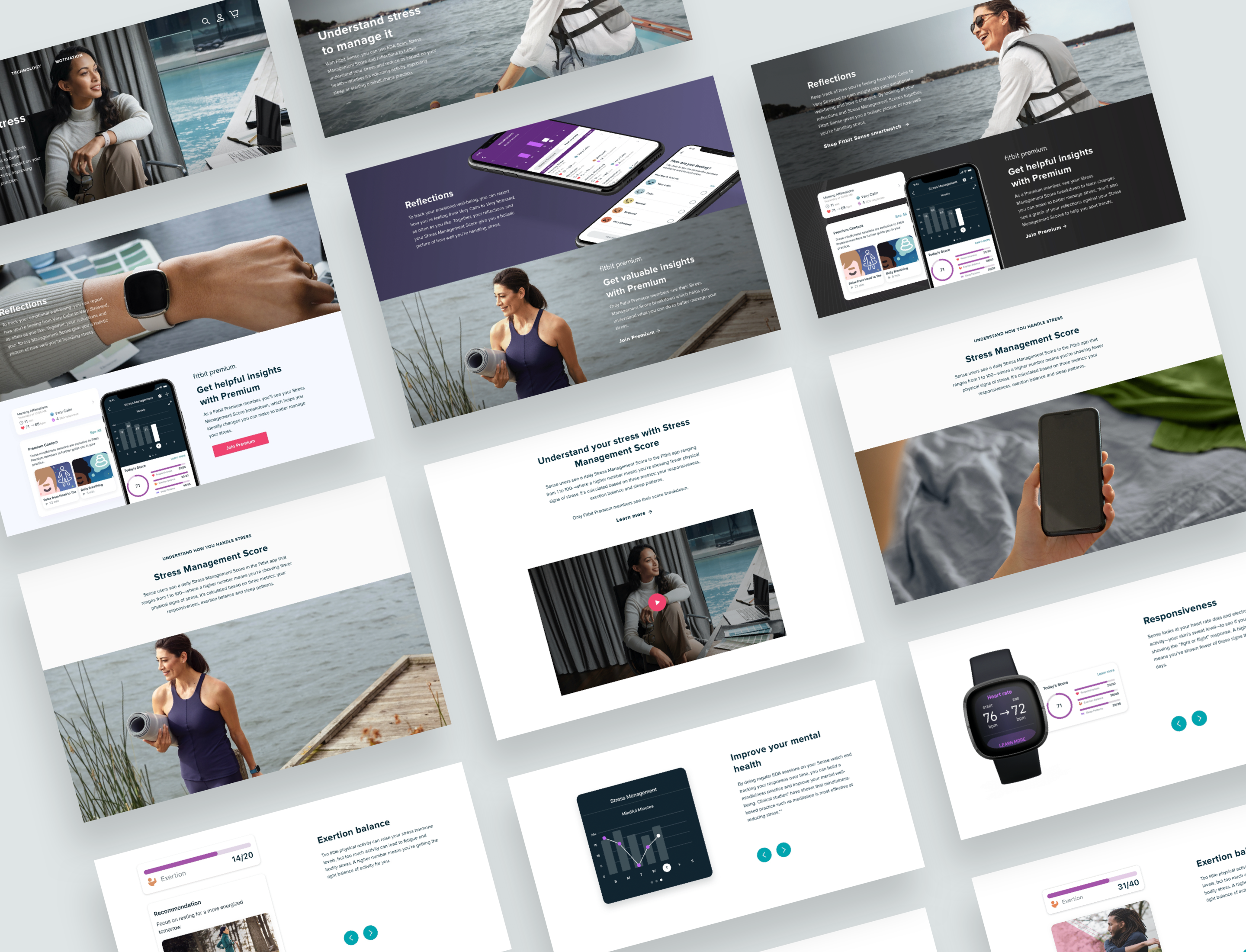
Layout, photo, and graphic iterations
Working within a design system
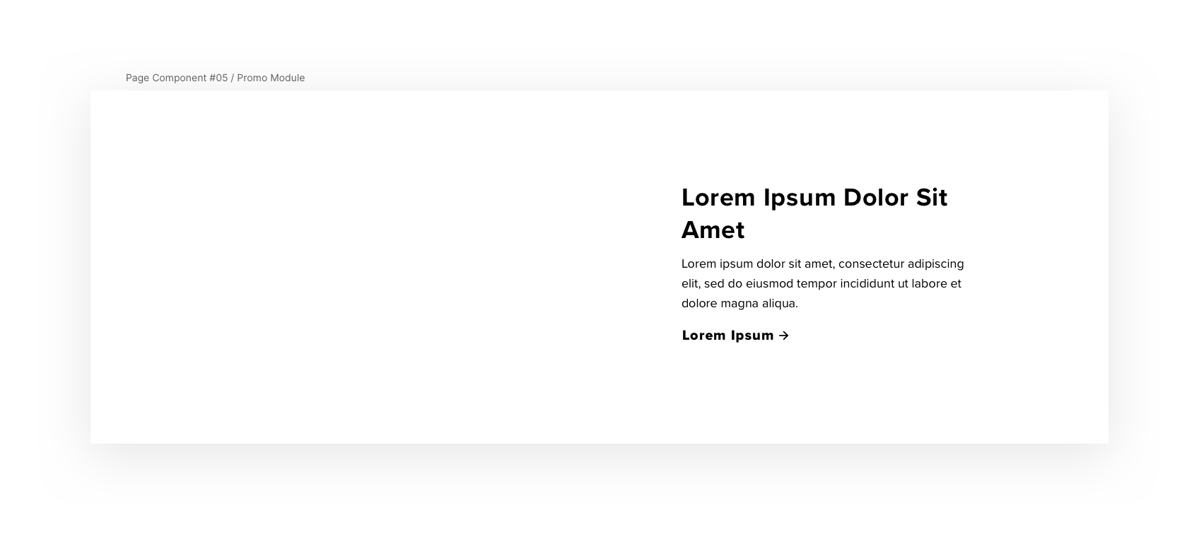
Using the Fitbit design library in Zeplin, I designed multiple layout iterations within Sketch to find the most optimal components and assets to ensure an ideal page length and a responsive design.
Creating graphics for visual learning
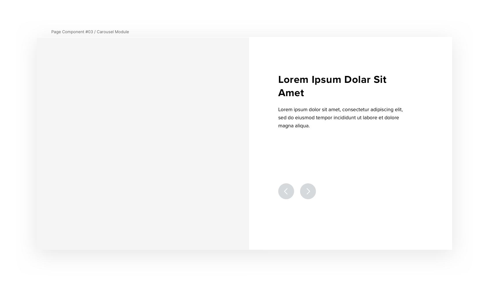
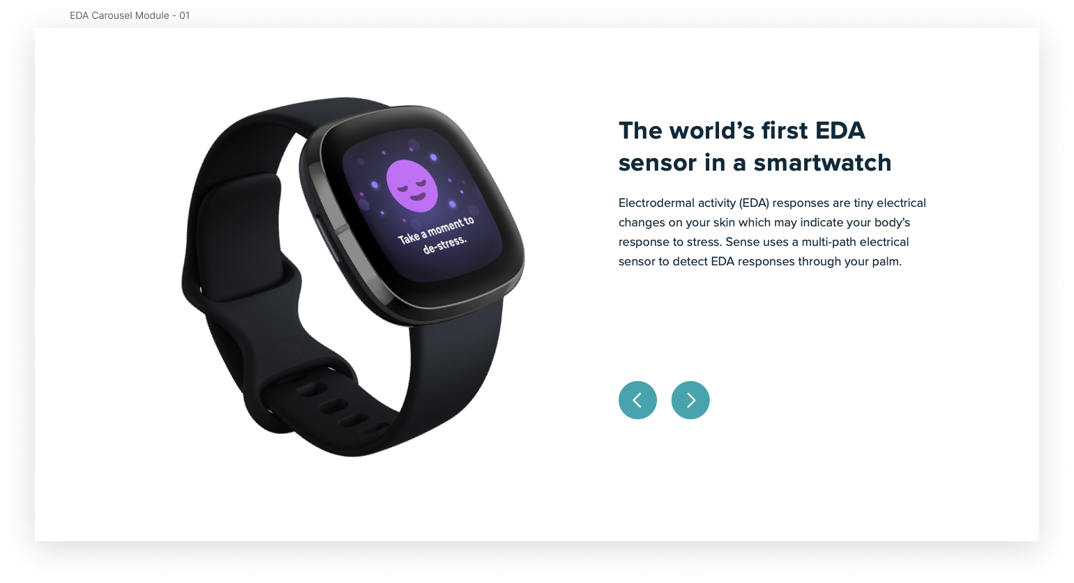
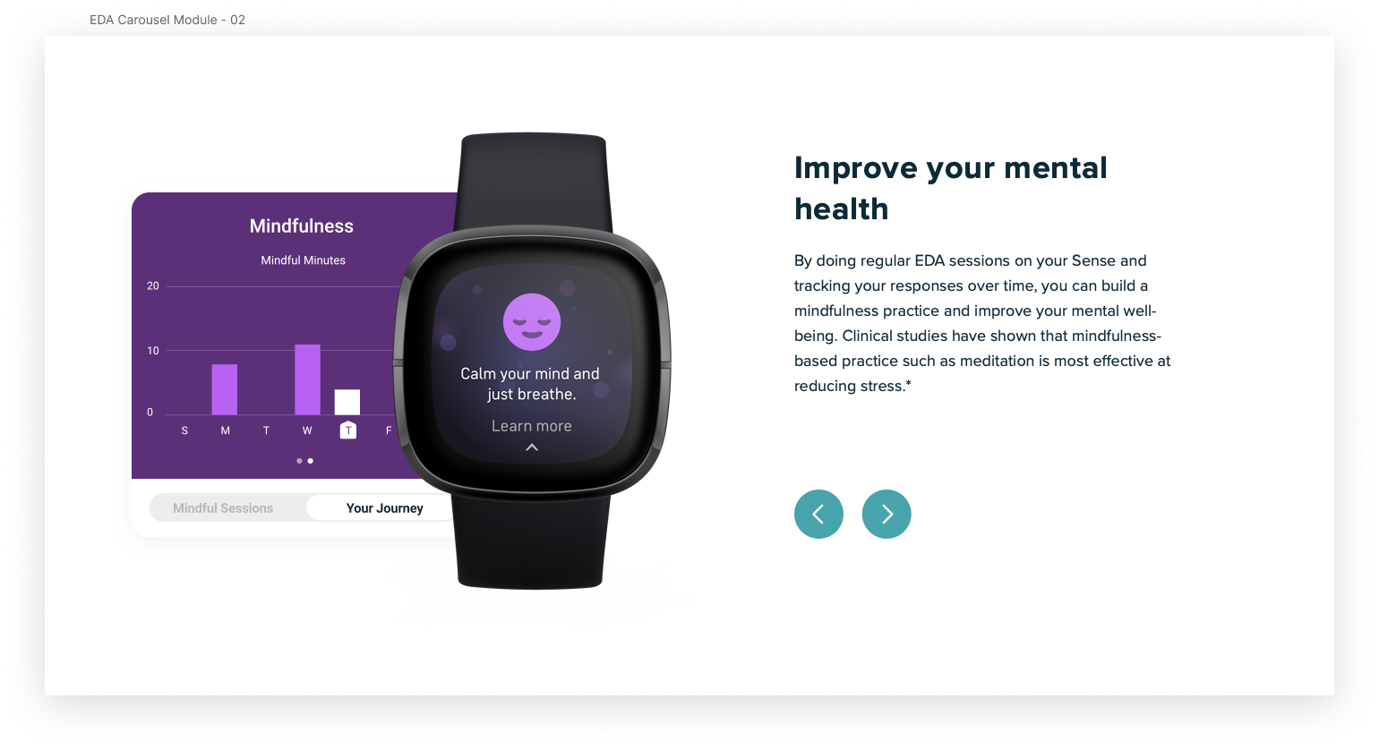
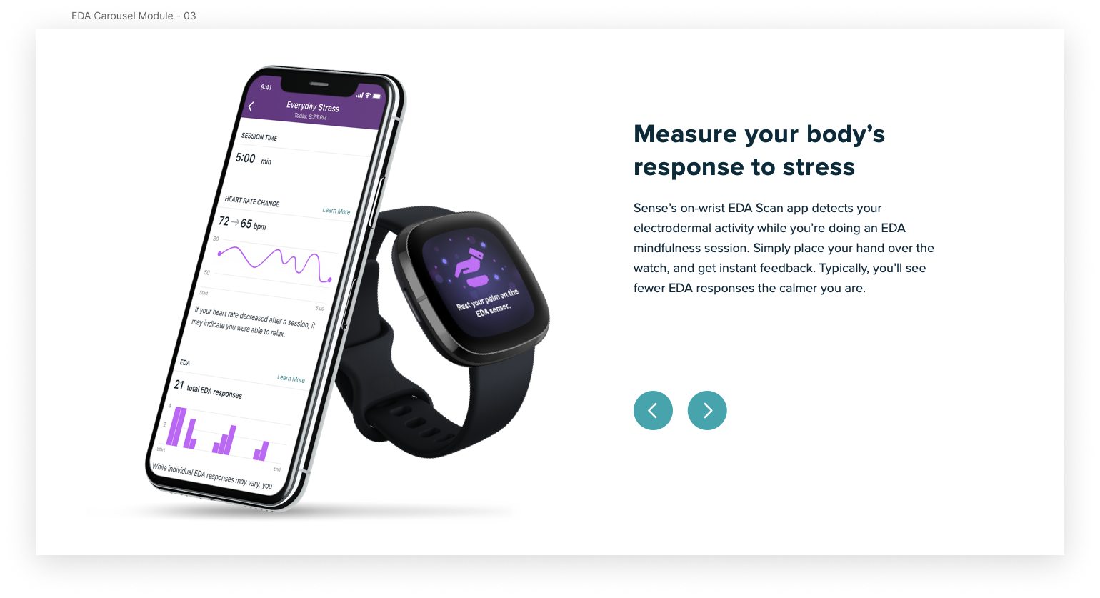
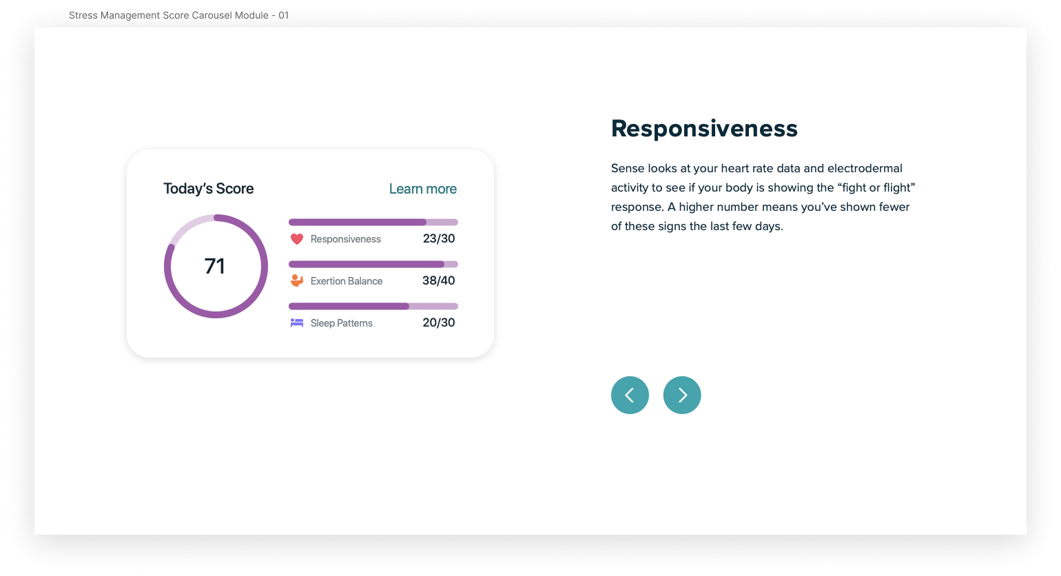
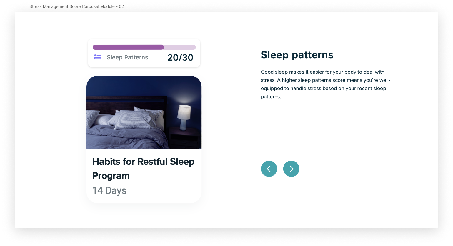
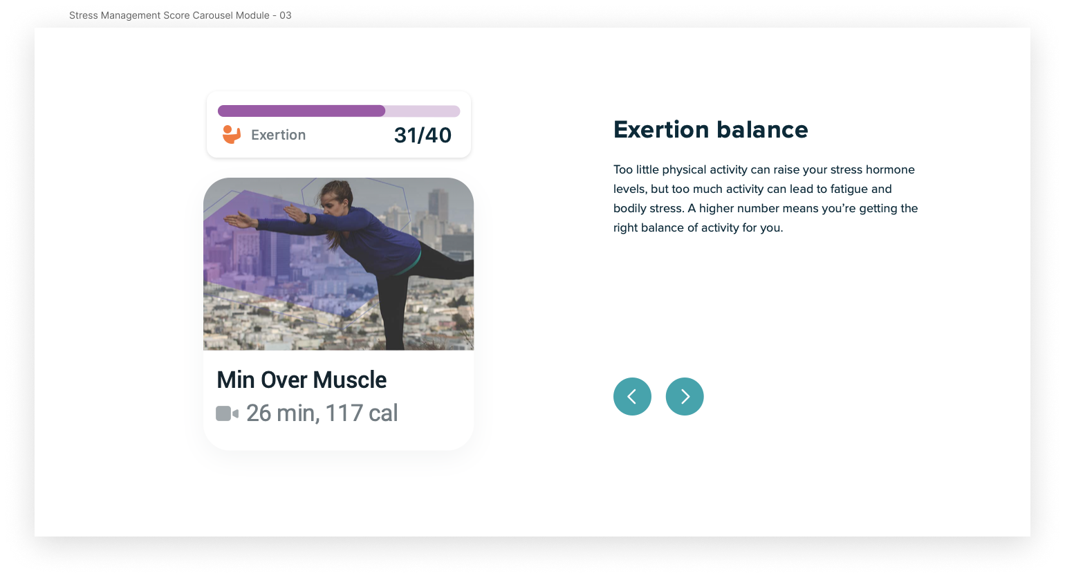
I also designed graphics of device mockups to illustrate the information in the carousels and marquees. There were hundreds of possibilities as there were no specific requests for which screens to use from both the smartwatch and the Fitbit app. Digging through design files, I collaborated with the copywriter and evaluated which screens would best encapsulate the copy so that users can visibly learn just as much.
These images needed to be visually engaging while not reusing the same mockup style, which required exploring new layouts while maintaining brand consistency. I accomplished this by isolating screen sections to highlight specific information or placing entire screens within smartwatch or phone mockups and realistic photo renderings.
Result
After many rounds of reviews and iterations, we came up with a page designed with a sense of clarity and purpose and is responsive across desktop, tablet, and mobile. Accessible navigation allows users to jump between sections of the page efficiently, carousels make information digestible, and multiple CTAs guide users to find more relevant details. It is such a rewarding experience to see a page I worked on go live and know that many new Sense users will be visiting and learning from this page.
Takeaways
🤝 Executing Design-to-Development Handoff
This project gave me valuable experience in handing off deliverables for development in a consumer-facing environment. I made a PDF guide with development notes detailing the component types and usage, ensured pixel perfection within organized layers in my final Sketch file, and exported all assets with correct naming conventions. This guide helped the developers quickly localize the page for the global market and launch the page as fast as possible.
🌟 Practice Makes Perfect!
Throughout my time at Fitbit, I learned to consistently elevate the quality of my designs by soliciting feedback from peers and stakeholders through formal design reviews and presentations. It was a tremendous growth experience to pitch and present my designs at numerous reviews, practice guiding open conversations and sharing my point of view, and learn from my mentors when to pushback on stakeholder feedback. I learned how essential maintaining good communication is with my team, especially when asking clarifying questions to remove blockers and balance pressing deadlines.

